来自coursera上约翰霍普金斯大学Data Science系列课程Course4:Exploratory Data Analysis.
Princlples of Analytic Graphics
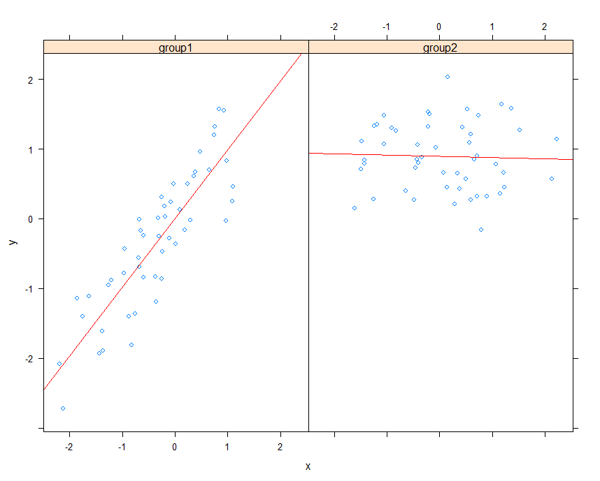
- Show comparisons compared to what(PM25 in house with aircleaner compared to without aircleaner)
- Show casuality, mechanism, explanation show how you believe the world works(show you believe child living in house with lower pm25 is more likely to be healthy)
- Show multivariate Data more than 2 variables
- Integrate multiple models of evidence don't let the tools drive the analysis(plot depend on your own idea, not the tools)
- Describe and document the evidence
- Content is king
Take a Look at the Data
1 | library(datasets) |
One dimension
- Summary
1
summary(airquality$Ozone) # 臭氧
- Boxplots
1
2boxplot(airquality$Ozone, col = "blue")
abline(h = 100) - Historgrams
1
2
3
4hist(airquality$Ozone, col = "green", breaks = 100)
abline(v = 100, lwd = 2)
abline(v = median(airquality$Ozone), col = "magenta", lwd = 4)
rug(airquality$Ozone) - Barplot
1
barplot(table(airquality$Month),col = "wheat")
Two dimensions
- Multiple Boxplots
1
boxplot(Ozone ~ Month, data = airquality, col = "red")
- Multiple Historgrams
1
2
3par(mfrow = c(2,1), mar = c(4, 4, 2, 1))
hist(subset(airquality, Month == 5)$Ozone, col = "green")
hist(subset(airquality, Month == 8)$Ozone, col = "green") - Scatterplot
1
2
3
4par(mfrow = c(1,1))
with(airquality, plot(Solar.R, Ozone, col = Month))
legend("topright", pch = 1, col = c(5, 6, 7, 8, 9), legend = c("5月", "6月", "7月", "8月", "9月"))
abline(h = 100, lwd = 2, lty = 2)
Plotting Systems in R
Base Plotting System
- Base:artist's palette model, and usually needs two steps to create a plot
- representative:plot()
Two packages
- graphics(including plot, hist, boxplot, etc)
- grDevices(including X11, PDF, PostScript, PNG, etc)
Two steps to create a base plot
- Initializing a new plot
1
2library(datasets)
with(airquality, plot(Wind, Ozone)) # Scatterplot - Annotation an existing plot
1
2model <- lm(Ozone ~ Wind, airquality)
abline(model, lwd = 2)
Base Plotting Functions
Initialize
- plot:initialize a new plot
- hist:initialize a new hist
- boxplot:initialize a new boxplot
Add
- lines:add lines to a plot
- abline:add lines to a plot
- points:add points to a plot
- text:add text labels to a plot using specified x, y coordinates
- title:add annotations to x, y axis labels, title, subtitle, outer margin
- mtext:add arbitrary text to the margins
- axis:add axis labels
Some Important Base Graphics Parameters
- pch:the plotting symbol
- lty:the line type
- lwd:the line width
- col:color
- xlab:string for the xlab
- ylab:string for the ylab
- las:the orientation of the axis
- bg:thebackground color
- mar:the margin size
- oma:the outer margin size
- mfrow:number of plots per row, column
- mfcol:number of plots per row, column(differ in order)
Default parameters:
1 | par("bg") # "transparent" |
Examples
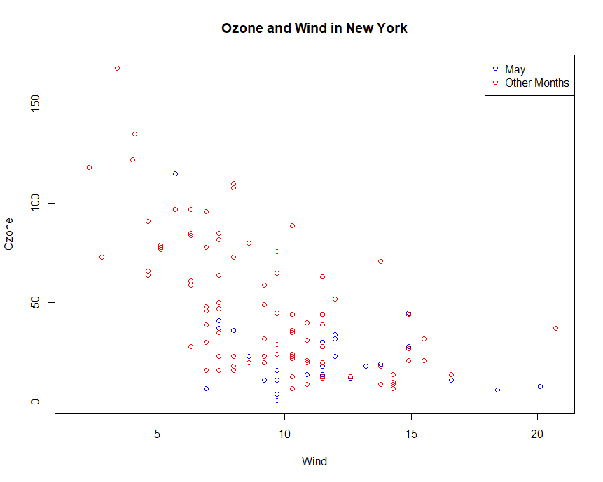
Example:Legend
1 | with(airquality, plot(Wind, Ozone, main = "Ozone and Wind in New York", type = "n")) |
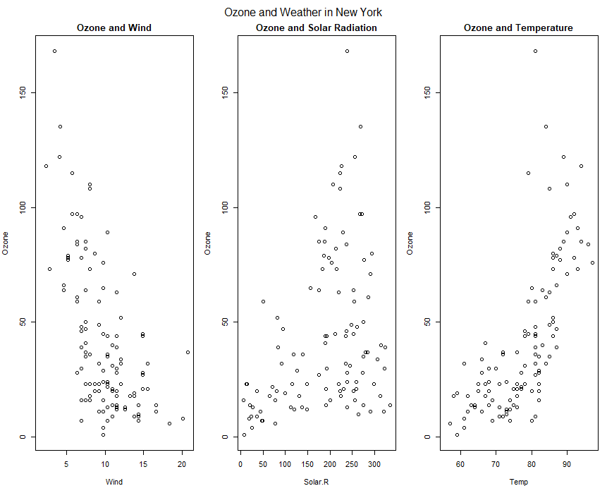
Example:Multiple Base Plots
1 | par(mfrow = c(1, 3), mar = c(4, 4, 2, 1), oma = c(0, 0, 2, 0)) |
The Lattice System
- Lattice:Entire plot specified by one function
- useful for plotting high dimensional data(conditioning plots)
- different from base plot driectly to the graphics device, lattice plot returns an object of class trellis (and will be auto-printed)
- representative:xyplot()
Two packages
- lattice(including xyplot bwplot, levelplot, etc)
- grid(usually indirectedly called through lattice or ggplot2)
Lattice Functions
- xplot:create scatterplots
- bwplot:box-and-whiskers plots
- histogram:histograms
- stripplot:like a boxplot but with actual points
- dotplot:plot dots on "violin strings"
- splom:scatterplot matrix(like pairs in base plotting)
- levelplot, contourplot:for plotting "image" data
Examples
Example:xyplot
1 | library(datasets) |
Example:plane functiuon
1 | library(lattice) |
The ggplot2 System
- ggplot2:Mixed elements of Base and Lattice
- book
: In brief, thegrammar tells us that a statistical graphic is a mapping from data to aesthetic(美学) attributes(color, shape, size) of geometric objects (points, lines, bars).The plot may also contain statistical transformations of the data and is drawn on a specific corrdinate system. - representative:qplot(), ggplot()
Basic Components of a ggplot2 Plot
- a data frame
- aesthetic mapping:how data are mapped to color, size
- geoms:points, lines, shapes
- facets:for conditional plots
- stats:binning(柱形分析), quantiles, smoothing
- scales:for example:sex
- corrdinate system
1 | library(ggplot2) |
Annotation
- labs and theme
- xlab(), ylab(), ggtitle(), labs()
- theme(legend.position = "none")
- theme_gray()
- theme_bw()
1
2
3
4
5library(ggplot2)
data(mpg)
g <- ggplot(mpg, aes(displ, hwy))
g + geom_point(color = "steelblue", size = 3.14, alpha = 0.5) + labs(x = expression(PM[25]))# alpha表示透明度
g + geom_point(aes(color = drv), size = 3.14, alpha = 0.5) + ggtitle("title") + theme(plot.title = element_text(hjust = 0.5))
1
2
3
4
5
6testdata <- data.frame(x = 1:100, y = rnorm(100))
testdata[50,2] <- 100
g <- ggplot(testdata, aes(x = x,y = y))
g + geom_line()
g + geom_line() + ylim(-3, 3) # 把y限定在(-3, 3)
g + geom_line() + coord_cartesian(ylim = c(-3, 3)) # 显示(-3, 3)的范围1
2
3
4testdata <- data.frame(x = 1:100, y = rnorm(100))
testdata[50,2] <- 100
cutpoints <- quantile(testdata$y, seq(0, 1, length = 4), na.rm = T)
testdata$y_new <- cut(testdata$y, cutpoints)
Examples
Example:geom
1 | library(ggplot2) |
Example:fill
1 | library(ggplot2) |
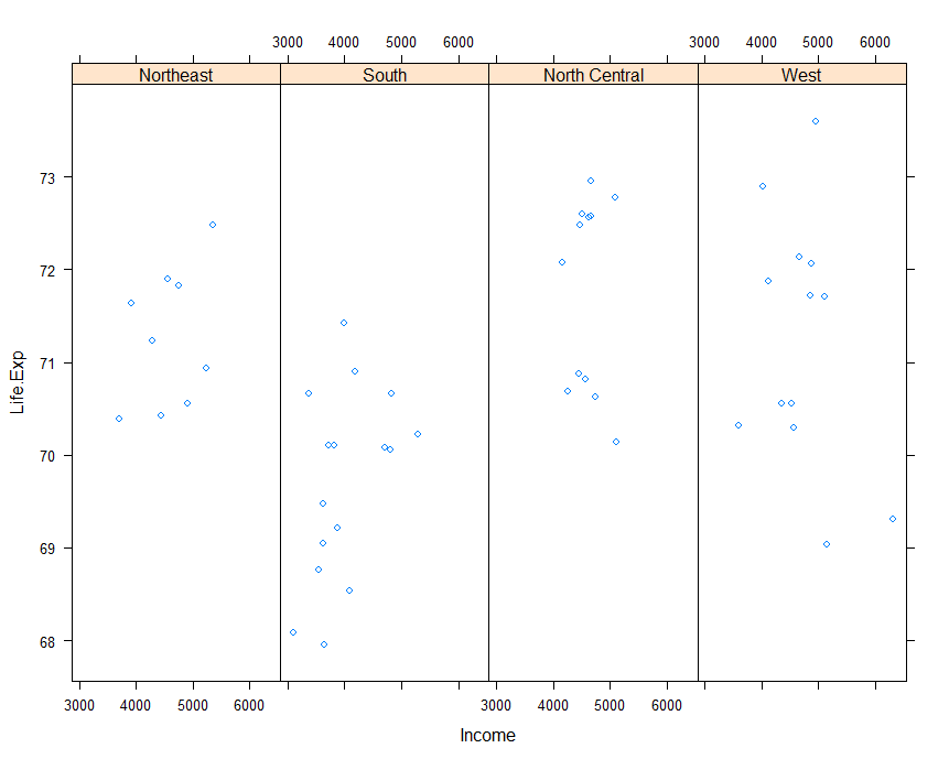
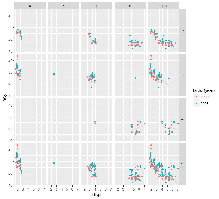
Example:facets
1 | library(ggplot2) |
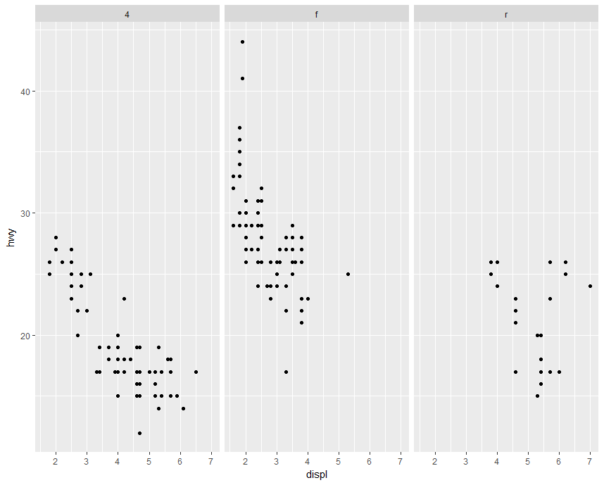
1
2
3library(ggplot2)
data(mpg)
qplot(displ, hwy, data = mpg, facets = drv~.)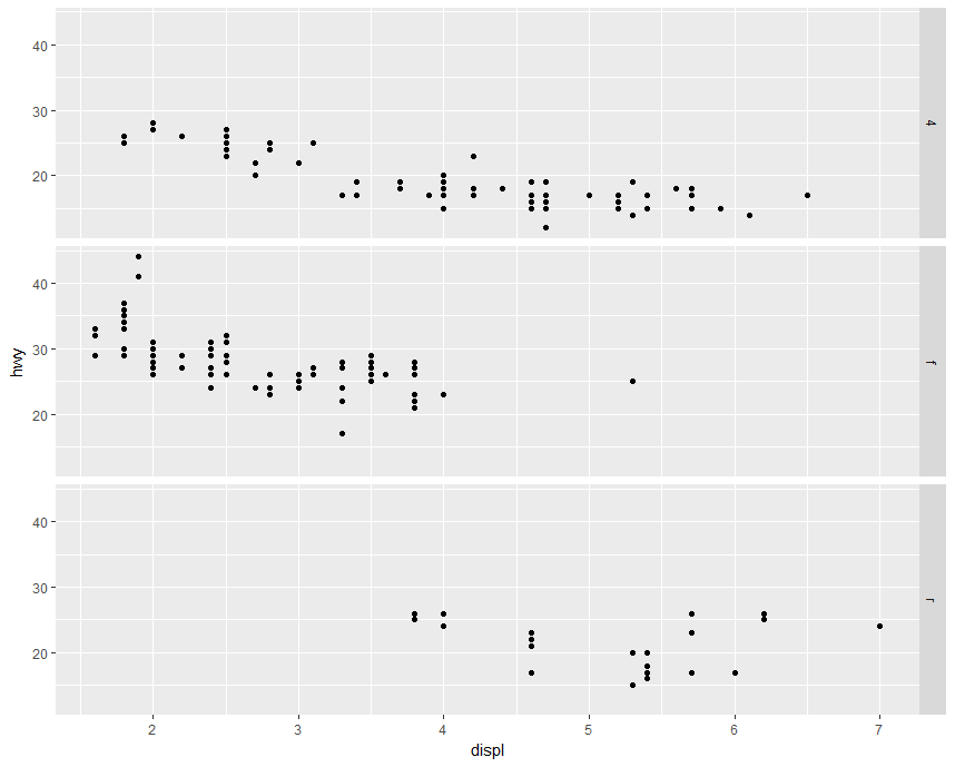
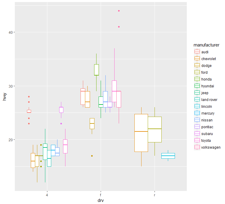
Example:boxplot
1 | library(ggplot2) |
Example:ggplot
1 | library(ggplot2) |
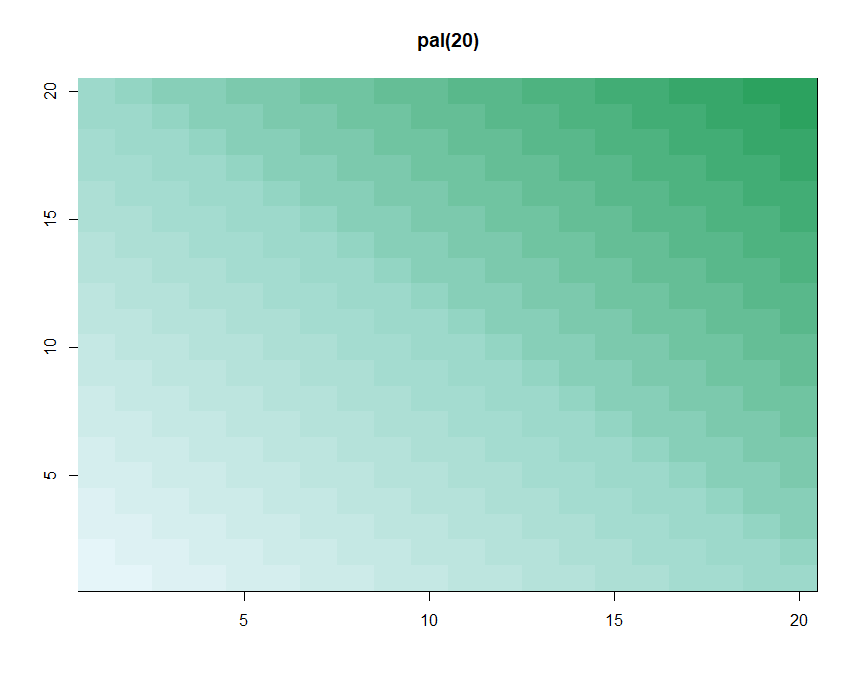
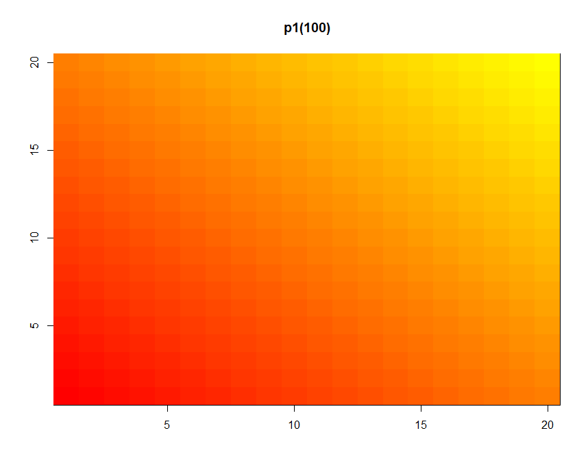
Color
1 | p1 <- colorRampPalette(c("red","yellow")) |
1
2p2 <- colorRampPalette(c("orange","yellow","green"))
showMe(p2(100))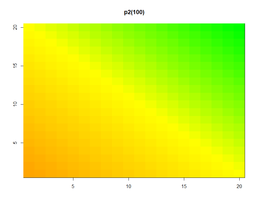
1
2
3
4cols <- brewer.pal(3, "BuGn")
showMe(cols)
pal <- colorRampPalette(cols)
showMe(pal(20))